Modula | Fullscreen
Updated on: August 12, 2025
Version 1.1.2
Single Purchase
Buy this product once and own it forever.
Membership
Unlock everything on the site for one low price.
Product Overview
Modula | Fullscreen is a powerful WordPress plugin designed to elevate your image galleries to a stunning new level. With its intuitive interface, you can easily create immersive fullscreen galleries that captivate your audience. Whether you're showcasing photography, art, or products, this plugin ensures your visuals take center stage. Plus, it offers a range of customization options, allowing you to tailor the look and feel to match your brand's identity. What makes it stand out is its responsive design, which guarantees a seamless experience across all devices. Dive into the world of fullscreen galleries and let your images shine like never before!
Key Features
- Stunning fullscreen gallery layouts that engage viewers.
- User-friendly drag-and-drop interface for easy setup.
- Fully responsive design to ensure perfect display on any device.
- Customizable options for colors, fonts, and styles to match your brand.
- Advanced lightbox effects for a professional presentation of images.
- Optimized for speed, ensuring quick loading times for your galleries.
- SEO-friendly features to help your images rank better in search engines.
- Regular updates and dedicated support for a hassle-free experience.
Installation & Usage Guide
What You'll Need
- After downloading from our website, first unzip the file. Inside, you may find extra items like templates or documentation. Make sure to use the correct plugin/theme file when installing.
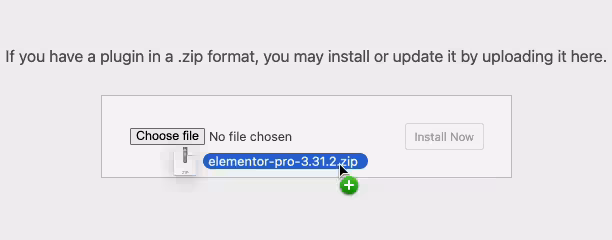
Unzip the Plugin File
Find the plugin's .zip file on your computer. Right-click and extract its contents to a new folder.
Upload the Plugin Folder
Navigate to the wp-content/plugins folder on your website's side. Then, drag and drop the unzipped plugin folder from your computer into this directory.
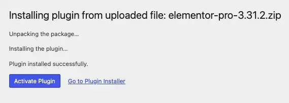
Activate the Plugin
Finally, log in to your WordPress dashboard. Go to the Plugins menu. You should see your new plugin listed. Click Activate to finish the installation.
PureGPL ensures you have all the tools and support you need for seamless installations and updates!
For any installation or technical-related queries, Please contact via Live Chat or Support Ticket.