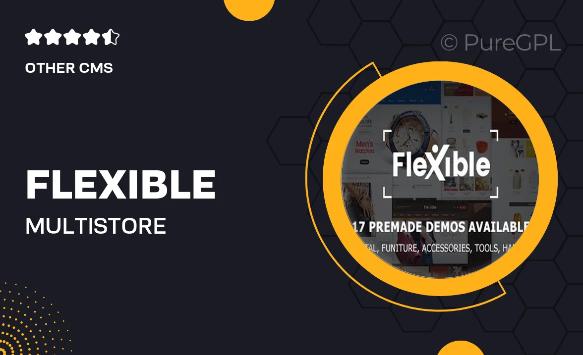
Flexible – Multi-Store Responsive Section Based Shopify Theme
Updated on: October 27, 2024
Version 1.0.0
Single Purchase
Buy this product once and own it forever.
Membership
Unlock everything on the site for one low price.
Product Overview
Introducing the Flexible Multi-Store Responsive Section Based Shopify Theme – the perfect solution for modern e-commerce businesses. This theme is designed with versatility in mind, allowing you to create stunning online stores that look great on any device. With its intuitive section-based layout, you can easily customize your store to reflect your brand's unique personality. Plus, it offers a seamless shopping experience for your customers, ensuring they stay engaged and satisfied. What makes it stand out is its responsive design, which automatically adjusts to various screen sizes, enhancing usability across all platforms.
Key Features
- Fully responsive design for optimal viewing on any device
- Customizable section-based layout for endless design possibilities
- Built-in SEO optimization to enhance your online visibility
- Fast loading times to improve user experience and reduce bounce rates
- Easy integration with popular payment gateways for hassle-free transactions
- Multiple pre-designed templates to jumpstart your store setup
- User-friendly interface that simplifies navigation and management
- Regular updates and dedicated support to keep your store running smoothly
- Compatible with a variety of Shopify apps to expand functionality